Over the previous weeks, I have been focusing my time on working on the smaller projects. I felt that by having less to work on I would reduce my stress levels, make my thoughts less jumbled and focus more of my energy on one thing. I am feeling confident that I will finish all the projects by my final deadline. I also believe that I am starting to overcome my creative block, frustration and fear of my final major project. At this point in the academic year, I currently have three projects to work on which are: Final Major Project (FMP), Final Major project R&D and Dissertation design. I was starting on my professional practice presentation, however, I recently found out that I will be emailed question before my presentation. I feel I shouldn’t start creating this presentation till I have received the email.
Over the Easter holiday, I have really struggled to find ideas for my final major project, I feel this was due to the stress of having so many things to juggle at once. After I had final cut down my workload, I went back to the drawing board for my final major project. How could I make it more creative yet keep the direction I was going towards? I started looking at design trends on graphic mama, the link can be found below this post. I noticed that typography was still very strong in contemporary design, as well as hand-drawn illustrations and double exposure. I was wondering if I could add this to my FMP, it was also helping to stimulate ideas for my dissertation design which I was still struggling with.
I created a Pinterest board of illustrations, what is currently being done in the mental health community and anything linking to the creative brain. I was drawn to the vibrant pain stains, ink smudges, split-brain designs. I started thinking if it was possible to bring the vibrant colours into my designs, incorporate the paint stains and bursting effects.
I thought to myself that I was starting to create a visual language for the magazine design. I knew that I wanted each article to be different, inducing creative ideas in the audience while keeping them engaged with the magazine. Yet I knew I had to have a sense of consistency. I first started working with the world of views article, I wanted to turn the solid overlaying colours blocks into paint stains. This would allow me to keep the original style while throwing in a creative twist that I hadn’t seen done in an editorial design before. While I still have a few more pages and spreads to go, I am really pleased with the direction the spreads are going towards. The designs can be seen below.


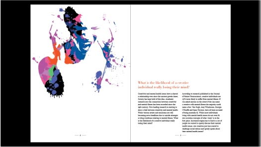
As I wanted to create different styles for each article but keep a visual language throughout. I decided to play around with photomanipulation for the first article; Are creative more likely to suffer from mental health issues? I re-read through the article picking out callouts while questioning what images would work with the article. I decided to use an image on a woman screaming with the callout “What is the likelihood of a creative really losing their mind? I feel that the scattered paint revealing an abstract woman draws the audience to the question, while still keeping in tune with the visual language of the overall magazine.
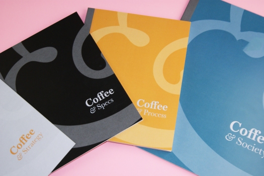
My next steps are to find a style that I can use on the title pages, I also feel that I currently have four articles, which I believe is not enough for a magazine, due to it only spreading over 88 pages. I currently have colleagues who have over 150 pages. I am aware that it is not quantity but quality, however, I feel that my magazine is still on the small side. To bump up my pages, I feel I need to write a few more articles. With the extended writing, I also feel I need to keep pushing the project forwards, finding more creative solutions for encapsulating the audience and getting the education about a serious topic.
I feel that using a variety of techniques through the editorial design shows the ranging skills that I have as a designing. The ability to work with typography, illustration, photography, photo manipulation and journalism. I also feel that the different style through the magazine will target the creative audience and get people discussing the topics of each article. The creative photography and illustrations should draw the audience into asking the bigger questions.
Links: